01 — Why it mattered
The team wanted a comparison surface where the visual hierarchy did most of the work — without sacrificing speed.
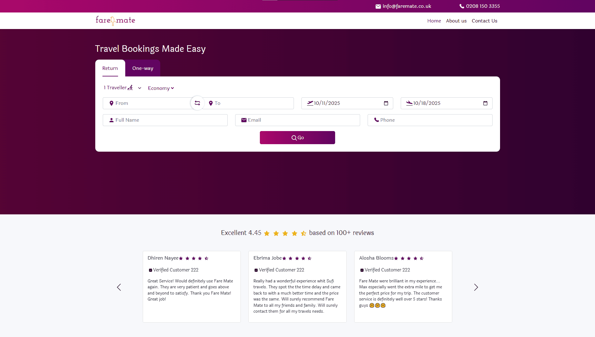
A flight comparison site built for performance, UX clarity, and conversion-first analytics.
02 — Problem
Existing comparison sites in the space were either fast and visually flat, or pretty and slow. The brief was to do both.
03 — Approach
Editorial layout for the results: typographic price hierarchy, restrained colour, a single accent. The interaction model is keyboard-friendly and the analytics layer is wired to the funnel, not the page.
04 — Build
Built on Next.js with a Tailwind design system shared across the booking surface. Conversion tracking integrated cleanly into the route boundaries.
05 — Outcome
The leanest build in the portfolio: 27KB of JavaScript over 16 requests. Most of the layout is type and spacing, so most of it is free — the design system does the work the bundle would otherwise be asked to do.
06 — Reflection
Most of the design work happened in the type ramp and the spacing scale. Everything else was downstream of those two decisions.